
We decided to use an close up of Beth's face to entice the audience and to immediately grab their attention when they see the poster, the fear of Beth's face, the style and the actual name of the film 'Possessed' all automatically signify to the audience before they've heard or seen the trailer of the film that it is an horror film.
 This is the closeup of Beth we plan to use for our film poster. We chose this photo because we believe it sums up and signifies the genre horror as Beth is screaming is signifying fear and terror this also gives the audience an insight to what our film may be about such as the setting as the photo is shot in a forest same place to where the film is shot.
We first attempted to create this effect using photoshop with the blur tool. However we had great difficulties creating the correct effect we wanted as the blur tool was to large and we didnt know how to change this because of our lack of knowledge in photoshop.

One of the students in our class told myself and Ciara about a new media technology website called 'picnik' created to make editing photos easier. The website unlike photoshop was very simple and straight forward to use, with instructions step by step telling how to edit your chosen picture. It also allowed you to edit the contrast, opactity, colour, size etc of your uploaded photo.

Here is our photo after editing using picnik as you can see we applied a blur effect to the outside of the image and it was very effected as you could still the whole of Beth's face creating an intense mood.
 We then uploaded the picture onto photoshop so we could add the credits and release date.
 We were undecided to use the colour white or red however when testing each colour white stood out the most against our background picture creating greater impact to the audience. We also decided to make the release date bold so it would stand out and catch the audiences eye.

 To get inspiration for the font for our film poster we googled images of Ouija boards and began creating fonts similar to the typography used on Ouija boards using photoshop and the blur effect, we chose the colours typically used on Ouija boards however the title we created looked unprofessional and amature.
So instead we used a new media website called 'dafont.com'. From this website we downloaded a free font called '28 days later' and installed it on to photoshop to use for our film poster and changed it to the colour white matching with the release date
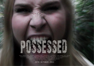 Overall we were very happy with the final outcome of our poster design as we overcame several difficulties when creating it, it took a while to complete our film poster because we didn't want to cover a lot of Beth's face but then again we wanted the title to be larger to create an impact to the audience.
Although the film industry has been in existence for over 100 years, it is still considered by some a fairly new medium, with now being a multi billion industry an large aspect of this industry is the communication to the public and audience through advertising such as film posters. There are several ways in which this placement and distribution can occur. The most common way is normally the film producer/director will contact an advertising agency who's job it is to make sure the film is made know of to the public. The advertising agency will have an understanding of the target audience of the film and using this knowledge will make contact to the owners of where they would like the film advertised for example an bill board company.
Ciara and I created an example of what our film poster would look like if it was distributed on bill boards or signs for the public to see.
