Thursday, 10 May 2012
Overall coursework grade: A
Well done - obviously subject to moderation by Mr Jackson and then moderator but you should have enough to hold the grade.
Wednesday, 9 May 2012
Welcome to my A2 media blog.
I have posted and screen printed and scanned any initial thoughts and planning when concerning my A2 media project allowing you to have an understanding and full knowledge of my A2 process. My project consisted of a short five minute film and two ancillary tasks of my choice. Previously in year 12 I got an A overall for my AS coursework and I would like similarly get grade A for my A2 coursework.
I hope you enjoy reading about my project and hard work as much as I enjoyed doing it.
Here is our final evaluation, we decided to create a podcast because we thought it was an inventive way of sharing our thoughts and opinions of our A2 project. A podcast is a fairly modern type of digital media consisting of an series of audio files which can be subscribed and downloaded through the web by being streamlined to a computer or mobile device. To make this as realistic as possible we researched and listened to a range of podcasts which helped us make the decision to use a interview process to express our thoughts. We used a mixer and microphone to record our podcast in a quiet room to achieve the best sound quality as possible.
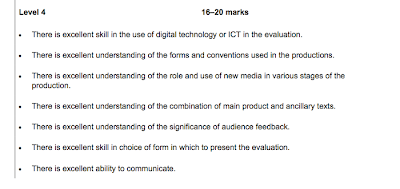 We used the level 4 mark scheme as a basic outline for all of the questions to be answered. We hope to aim for either 17-19 marks out of 20 which will help us achieve our grade A for our coursework.
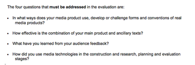 We decided to use our teacher Ms Ward as our interviewer because she had a unique and professional tone to her voice.
Below is the basic outline and script we used as a basic prompt when recording our evaluation
 We used the level 4 mark scheme as a basic outline for all of the questions to be answered. We hope to aim for either 17-19 marks out of 20 which will help us achieve our grade A for our coursework.
 We decided to use our teacher Ms Ward as our interviewer because she had a unique and professional tone to her voice.
Below is the basic outline and script we used as a basic prompt when recording our evaluation
Sunday, 6 May 2012
Here is the full final edited version of our film.
We uploaded our film on social networking and new media websites such as Viemo and Facebook. We received a lot of positive criticism as well as some negative.
For example people loved the use of the 'rec' sign to symbolise that we were filming a home video as this added a sense of realism and allowed the audience to relate with our film. However quite a few negative comments about the ending of the film was said we decided to use a open narrative allowing the audience to make there own decision on how the film ended. However it was said that people would have preferred if we showed a definite ending or at least an image of Beth screaming similar to the one we used on the poster instead of the static video tape clip which we believe added a sense of realism.
One of the big changes from our first film to our second was the use of narrative throughout the film, when we pitched our film idea to a group of media students they gave us the idea of using music to help tell the narrative we planned to use this idea for our film until we began to edit the film. We planned to use music to show time passing by and to convey the horror genre however when adding music to our film we believed it destroyed the realistic style of the film and didnt match with the idea of a 'home video' so instead we used Ciara's voice as a personal reflection of the events which added to the realistic horror as the film was now portrayed as past memory as the first shot the viewer sees is a closeup of Ciara's face which automatically engages the audience and creates a personal response.
I hope you enjoy the film as much as we did making it.
Tuesday, 17 April 2012
To further our short film knowledge as a group we were luckily enough to visit the European Independent Film Festival in Paris.
As a media student this made me realise that people create short films for many different reasons from personal to business or to even portray a message, for example the short film 'Smashed' I annotated at the beginning of the year had a message which was encoded to the audience by the smashed egg on the pavement in the establishing shot the egg represented the idea of broken lives, pregnancy and fertility.
Occasionally short films are created to show off an unknown directors skills, once completed the director will send off their work to film festivals, or large film companies in hope that their work will be liked and further distributed. However not all short films have to be for business a large number of people create short films for simply fun and enjoyment.
Funding for short films often depend on the reason behind making it. Short films may receive funding from the UK film council/British film institute or even National screen agencies. The Government may fund a short film if they wish to raise awareness of a certain cause or message this is also similar with Charities. A fairly new method of showing short films is competitions, film festivals or production schemes. These allow mainly young and undiscovered film directors to be highlighted and to show off work meaning they will receive positive and negative criticism.
Once an directors work has been noticed distributors are then brought into the equation they are normally individuals or an separate organisation that will hopefully share the work and will try to create as much exposure for the film as possible whether this is at film festivals such as ECU or even television, radio or the most common way online. For this stage to happen the film has to abide certain rules in order to be distributed such as copyright so an agreement is put in place negotiating the profit outcome and the ownership of the film.
Monday, 12 March 2012
Today we began shooting our first scene for our film.
Using our plan we decided to shoot our film in Ciara's house because we thought it was a reliable and consistent location.
When reflecting on todays shoot I personally think it was large improvement from our previous film. However next time when we decide to shoot we plan to shoot later on in the evening so the sunlight isn't as bright again conforming to one of the typical horror film conventions.
Thursday, 8 March 2012
Before we starting shooting to in ensure we were fully equipped and didn't forget anything we created a props list below;
- ouija board
- birthday cake
- glasses
- wine/drinks
- door keys
- candles
- matches
- matches box
- video camera
- script
- birthday banners
- mobile phone
Friday, 16 December 2011
Below is our first draft for our radio trailer.
We shared our trailer on the social networking site facebook and recieved some mixed crictisms. Alot of people commented and said how they were impressed with the overall tone of the film as it followed and conformed to the typical horror conventions found in Horror radio trailer.
In particular people commented and liked the 'Happy Birthday' aspect at the start of the trailer as they said it created a 'creepy' tone and intrigued them. However a dislike from many people was the main dialogue being spoken which informed the audience about the name of the film and release date etc. It was said that it seemed to 'computerized' and unrealistic which didnt link with the theme and style of our film which is realistic horror.
After reflecting on the comments received myself and my partner Ciara agreed with the comments made and agreed to re record our trailer however this time using a younger speaker relating more with our target audience which is 16-30 males and females. To ensure that the sound of our new recording will be perfect is we decied to re record in a silent room with only myself Ciara and the speaker present.
Below is our new trailer;
Friday, 9 December 2011
After researching example radio trailers and the conventions of horror film trailers Ciara and I began planning our own trailer and created a basic script to help us when recording our trailer.
We will record our trailer using garageband and a basic mixer and microphone, I had previous knowledge from garageband from my year 12 project however using the mixer and microphone was a new experince so we had to learn how to use the equipment before creating our trailer.
We youtubed a selection of horror films and saved the backing tracks using youtube convertor for our trailer. We then planned to use garage band to overlap and fade different backing tracks in and out to create a horror themed trailer.
Tuesday, 6 December 2011
Today we began researching and discussing our ideas for our radio trailer, after much research on the internet we found it very difficult in finding a radio trailer in the horror genre, so instead we began researching film trailers using youtube just to focus on the audio and pick up on any key conventions of sound that we could find.
One film trailer that helped us understand the typical audio conventions was 'The Eye'
'The Eye' taught us a lot about how to increase tension and alter the pace and tone of a trailer just by changing the sound and tempo of music. Within the 'The Eye's' trailer the music was constantly increasing and slowing down in pace portraying and parrelling the action and fear. This change in sound also keeps the audience on edge and stops them knowing what to expect next linking with the genre of the film which is horror. Throughout 'The Eye' voice clips of the characters is used along side long slient pauses this adds an intense fear and gives the audience an exceptation of what to expect from the characters and the film.
Thursday, 1 December 2011
Ciara spoke to each other over text and both agreed we wasn't pleased with the outcome of our film so far and decided to organise a group meeting to discuss what we shall do.
At the group meeting we both discussed what we dislike in our film, and came to the conclusion that perhaps our film should only have 3 characters instead of 4 due to our Fourth actor was very unreliable meaning that it was not always possible to shoot when needed which automatically put us behind schedule.
We also discussed our location choice and realised that the abandoned house we shot our sample scene in was not possible to shoot the rest of film in and came to the conclusion we needed to create a new plan. We began brainstorming a few new ideas however soon realised starting from scratch this late into the year would be impossible so instead we would keep the general idea and theme of the film.
We decided we would keep with the same genre and the story that the group of young teenage girls play the Ouija board and one of them becomes possessed however instead of them stumbling across an Ouija board in an abandoned house which seemed rather unrealistic instead it was one of the girls birthdays and together they were making an home video found the Ouija board in the house as it belonged to one of the girls mums and then still like the original film the character 'Beth' becomes possessed.
The main difference from our first film to our new idea would be the shift in the role of the protagonist, we decided to enforce the idea of a home video using inspiration from our researched films Paranormal Activity Ciara would be a voice over reflecting on the video as if it was her memory.
Below is our notes we made during our group meeting;
We decided that if we wanted to complete our coursework we would have to start filming straight after the Christmas holidays and to guarantee that we would be organised we created a schedule and printed it off for myself and Ciara to keep as well as our same actor as before Beth below is an example of one of schedules that helped us keep on track.
Monday, 28 November 2011
For the past few days Ciara and I began filming our film following our shot list, however filming didn't plan out as easy as we would thought it would be unfortunately we didn't manage to finish the whole of our film due to unreliable actors and bad location choice however we carried on and began editing using the material we had using final cut, which you can see in the pictures below;
Monday, 24 October 2011
After researching and viewing other professional film posters in the genre of horror, we finally decided on an final design, below is the sketch;
We decided to use an close up of Beth's face to entice the audience and to immediately grab their attention when they see the poster, the fear of Beth's face, the style and the actual name of the film 'Possessed' all automatically signify to the audience before they've heard or seen the trailer of the film that it is an horror film.
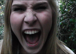 This is the closeup of Beth we plan to use for our film poster. We chose this photo because we believe it sums up and signifies the genre horror as Beth is screaming is signifying fear and terror this also gives the audience an insight to what our film may be about such as the setting as the photo is shot in a forest same place to where the film is shot.
When designing our film poster we came up with the idea inspired from photo booths 'tunnel' effect. We wanted to have Beth's face in the middle of the poster then her surroundings blurred so all the audiences attention would be focusing on her relfecting that she is being possessed and is losing reality.
We first attempted to create this effect using photoshop with the blur tool. However we had great difficulties creating the correct effect we wanted as the blur tool was to large and we didnt know how to change this because of our lack of knowledge in photoshop.
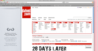 To get inspiration for the font for our film poster we googled images of Ouija boards and began creating fonts similar to the typography used on Ouija boards using photoshop and the blur effect, we chose the colours typically used on Ouija boards however the title we created looked unprofessional and amature.
So instead we used a new media website called 'dafont.com'. From this website we downloaded a free font called '28 days later' and installed it on to photoshop to use for our film poster and changed it to the colour white matching with the release date
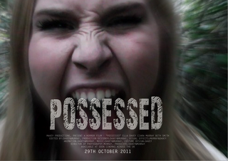 Overall we were very happy with the final outcome of our poster design as we overcame several difficulties when creating it, it took a while to complete our film poster because we didn't want to cover a lot of Beth's face but then again we wanted the title to be larger to create an impact to the audience.
Although the film industry has been in existence for over 100 years, it is still considered by some a fairly new medium, with now being a multi billion industry an large aspect of this industry is the communication to the public and audience through advertising such as film posters. There are several ways in which this placement and distribution can occur. The most common way is normally the film producer/director will contact an advertising agency who's job it is to make sure the film is made know of to the public. The advertising agency will have an understanding of the target audience of the film and using this knowledge will make contact to the owners of where they would like the film advertised for example an bill board company.
Ciara and I created an example of what our film poster would look like if it was distributed on bill boards or signs for the public to see.
We decided to use an close up of Beth's face to entice the audience and to immediately grab their attention when they see the poster, the fear of Beth's face, the style and the actual name of the film 'Possessed' all automatically signify to the audience before they've heard or seen the trailer of the film that it is an horror film.
 This is the closeup of Beth we plan to use for our film poster. We chose this photo because we believe it sums up and signifies the genre horror as Beth is screaming is signifying fear and terror this also gives the audience an insight to what our film may be about such as the setting as the photo is shot in a forest same place to where the film is shot.
When designing our film poster we came up with the idea inspired from photo booths 'tunnel' effect. We wanted to have Beth's face in the middle of the poster then her surroundings blurred so all the audiences attention would be focusing on her relfecting that she is being possessed and is losing reality.
We first attempted to create this effect using photoshop with the blur tool. However we had great difficulties creating the correct effect we wanted as the blur tool was to large and we didnt know how to change this because of our lack of knowledge in photoshop.

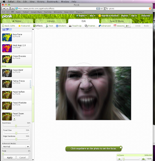
One of the students in our class told myself and Ciara about a new media technology website called 'picnik' created to make editing photos easier. The website unlike photoshop was very simple and straight forward to use, with instructions step by step telling how to edit your chosen picture. It also allowed you to edit the contrast, opactity, colour, size etc of your uploaded photo.
Here is our photo after editing using picnik as you can see we applied a blur effect to the outside of the image and it was very effected as you could still the whole of Beth's face creating an intense mood.
We were undecided to use the colour white or red however when testing each colour white stood out the most against our background picture creating greater impact to the audience. We also decided to make the release date bold so it would stand out and catch the audiences eye.
 To get inspiration for the font for our film poster we googled images of Ouija boards and began creating fonts similar to the typography used on Ouija boards using photoshop and the blur effect, we chose the colours typically used on Ouija boards however the title we created looked unprofessional and amature.
So instead we used a new media website called 'dafont.com'. From this website we downloaded a free font called '28 days later' and installed it on to photoshop to use for our film poster and changed it to the colour white matching with the release date
 Overall we were very happy with the final outcome of our poster design as we overcame several difficulties when creating it, it took a while to complete our film poster because we didn't want to cover a lot of Beth's face but then again we wanted the title to be larger to create an impact to the audience.
Although the film industry has been in existence for over 100 years, it is still considered by some a fairly new medium, with now being a multi billion industry an large aspect of this industry is the communication to the public and audience through advertising such as film posters. There are several ways in which this placement and distribution can occur. The most common way is normally the film producer/director will contact an advertising agency who's job it is to make sure the film is made know of to the public. The advertising agency will have an understanding of the target audience of the film and using this knowledge will make contact to the owners of where they would like the film advertised for example an bill board company.
Ciara and I created an example of what our film poster would look like if it was distributed on bill boards or signs for the public to see.
Saturday, 22 October 2011
Because we chose to create a film poster as our ancillary task, we began to research horror film posters. We created a mood board of horror film posters and in detail annotated two separate posters.
Below are the annotated film posters and the mood board of different film posters;
 |
| mood board |
From annotating film posters and creating a mood board, myself and my partner Ciara became aware of the typical conventions needed for a horror film poster such as;
- dark colours such as different tones of black grey and red
- faded images
- main character of film
- title
- release date
- credits underneath explaining director etc
- age certificate
- where the film will be shown
With this knowledge in mind we began roughly sketching our ideas for our own film poster.
Below are our rough designs;
Tuesday, 18 October 2011
Today myself and Ciara had another group meeting to discuss what ancillary task we choose to do. We had the choice of;
- radio advert
- film poster
- newspaper advert
Monday, 17 October 2011
After pitching our film and sample scene to an audience we thought this would be the right time for another team meeting to reflect on the feedback received from the audience to help us gain greater knowledge and improve on anything that we can maximising the potential of our film.
 As you saw from the video of our pitch we produced a short presentation consisting of a short sample scene, explanation of our story board and proposal using handouts and the interactive white board. Firstly we gave the class a quick summary of the proposal, explaining the plot, the cost, and locations we had in mind for our film. We then presented our story board to the audience allowing them to gain an greater insight to our idea and to understand the different camera angles, lightening and sound that we plan to use.
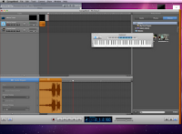
We received a range of feedback from positives too crictisms. After the presentation myself and Ciara watched the presentation back to gain a full understanding of the feedback and so we could decide on how to over come certain crictisms. The audience commented on the lack of sound in our sample scene and gave us the ide of using atmospheric quiet music when the characters are being watched to add tension and to create more drama. To correct this lack of sound Ciara and I began researching examples of horror sound effects on youtube and began experimenting different sound effects such as pouring rain, slamming doors and screams using garage band.
When first planning our film myself and Ciara had the idea to shoot the writing on the wall scene using a chromakey suit so it looked like the pen was moving by itself. However this idea turned out to be unsuccessful due to the lack of technology and knowlegde of using chromakey. The audience was made aware of this step back and gave us the idea of taking indiviual shots of each letter of the word "beware" then adding them together to create a disjointed, jiggered animation.
Although we did received some criticisms of our idea and sample scene overall I was very happy with the comments our sample scene received and I found the feedback extremely helpful as it helped us develop our ideas and see our film from a different perspective. I look forward to filming our actual film know and I will follow all the advice given to us to the best of my ability to ensure the quality of our film is improved.
The Exorcist piano soundtrack was one of the youtube videos we researched for inspiration for dramatic atmospheric music to add tension.
The slow build up of the same notes is something we will try to replicate when creating our film.
 |
| us beginning to use garage band |
 As you saw from the video of our pitch we produced a short presentation consisting of a short sample scene, explanation of our story board and proposal using handouts and the interactive white board. Firstly we gave the class a quick summary of the proposal, explaining the plot, the cost, and locations we had in mind for our film. We then presented our story board to the audience allowing them to gain an greater insight to our idea and to understand the different camera angles, lightening and sound that we plan to use.
We received a range of feedback from positives too crictisms. After the presentation myself and Ciara watched the presentation back to gain a full understanding of the feedback and so we could decide on how to over come certain crictisms. The audience commented on the lack of sound in our sample scene and gave us the ide of using atmospheric quiet music when the characters are being watched to add tension and to create more drama. To correct this lack of sound Ciara and I began researching examples of horror sound effects on youtube and began experimenting different sound effects such as pouring rain, slamming doors and screams using garage band.
When first planning our film myself and Ciara had the idea to shoot the writing on the wall scene using a chromakey suit so it looked like the pen was moving by itself. However this idea turned out to be unsuccessful due to the lack of technology and knowlegde of using chromakey. The audience was made aware of this step back and gave us the idea of taking indiviual shots of each letter of the word "beware" then adding them together to create a disjointed, jiggered animation.
Friday, 14 October 2011
Ciara and I met up for a team meeting and decided the best way for us to test to see if our film would work would to be to complete a sample test shoot, we plan to make sure the following things all went to plan
Untitled from Ciara Murray on Vimeo.
- location
- times of daylight
- acting skills of actors
- props look authentic
Untitled from Ciara Murray on Vimeo.
Monday, 10 October 2011
After annotating the six stills from the short horror film from Virgin Shorts, myself and Ciara decided to design and create our own ten shot story board for our film. We decided to use word processor to create the story board as this allowed us to make any changes as we went along.
 |
| image of us editing our storyboard |
I found describing the mise-en-scene especially difficult however with several re-drafts and the help of feedback from our teacher and class mates we over came this problem.
Below is our story board;
Thursday, 6 October 2011
Below is our proposal for our film. It is a basic written outline explaining the concept of our film, explains characters, props, location, money story line, and inspirations.
I found writing a proposal very useful as it made all of our rough planning and ideas more realistic and life like, and could be used for future reference when shooting or telling others of our idea.
I found writing a proposal very useful as it made all of our rough planning and ideas more realistic and life like, and could be used for future reference when shooting or telling others of our idea.
Tuesday, 4 October 2011
Ciara and I had another team meeting and came to the conclusion although myself and Ciara have analysed and watched many short films, we hadn't yet analysed individual still shots, which would be needed in order to complete our shot list for our film.
So we found a short horror film from Virgin Shorts and print screened six individual shots allowing us to annotate each shot separately. My lack of knowledge and understanding of shot lists was shown present when in my first draft I forgot about commenting on lighting which can be a major impact to the representation of the genre and shot. I corrected this problem and commented on the lighting after.
Below is the six still shots with my own annotations;
Tuesday, 27 September 2011
Coincidentally as class we watched a short horror film called "The Insane". This was a great influence for myself and Ciara as it confirmed and highlighted stereotypical horror film conventions.
Below is the short film 'The Insane';
We analysed 'The Insane' in an essay format answering the following question...
'Does the 'The Insane' use media language effectively to meet the conventions of the horror genre?'
I was very pleased with my grade from this essay, I managed to get 76% equalling a B. I think i gained this grade from my use in media language and technical terms, something in which i learnt from my previous essay on the short film 'Smashed'. I found watching 'The Insane' very useful as well as it confirming horror conventions such as;
- Dark lighting
- quick editing
- hero and villain characters
- slamming doors, heart beats
- slow and fast sound track
It gave great influence on editing and camera skills, teaching me new camera angles and showed how quick fast editing and the use of props can build tension and change the reflection of the plot and certain characters.
Below is my essay;
Wednesday, 21 September 2011
After analysing and watching examples of short films Ciara and I decided to have a team meeting to discuss more ideas for our film because we now understood how hard it was to portray an exact genre in the space of five minutes.
Here below is a spider diagram of our ideas;
In our team meeting we spoke about our favourite fims and created a mood board of all of our influences.
Here below is a spider diagram of our ideas;
In our team meeting we spoke about our favourite fims and created a mood board of all of our influences.
Friday, 16 September 2011
In order to have our knowledge up to date we revisited media technical terms and applied our knowledge about media language when analysing a short film called 'Smashed' written and directed by Peter Snelling.
Below is an clip of the short film and my notes I made when anaylising 'Smashed' and a spider diagram which I used to quickly brainstorm and further my ideas about the short film;
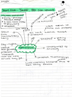
Even though I did learn about the basic media technical terms at AS I found this task quite difficult. When I first wrote the essay I came across several difficulties such as my points were not as developed as they could of been and instead of anaylising the film it was as if I was telling the story of the film.
However when redrafting my essay I over came these problems and my grade increased from a C to a B. I achieved this grade increase, by using media language such as;
- 'The council flat backdrop signifies the status and background of the characters'
Instead of..
- 'The council flat backdrop portrays the status and background of the characters'
By changing portray to signify I am showing the marker that I understand conceptual language and how to use it in my essay instead of just telling the examiner what happened in the film.
Here below is my completed essay;
Subscribe to:
Comments (Atom)


